Un-Label
2026
A modular icon system that embeds accessibility features into a unified visual language. The set replaces fragmented and outdated symbols with clear pictograms that work across digital and physical media. Instead of treating inclusivity as an afterthought, the work embeds it into the core design language.
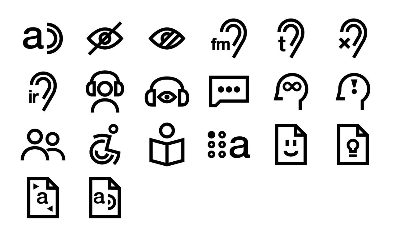
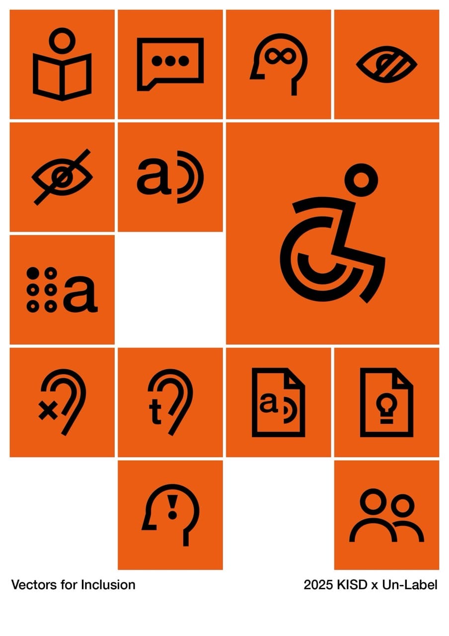
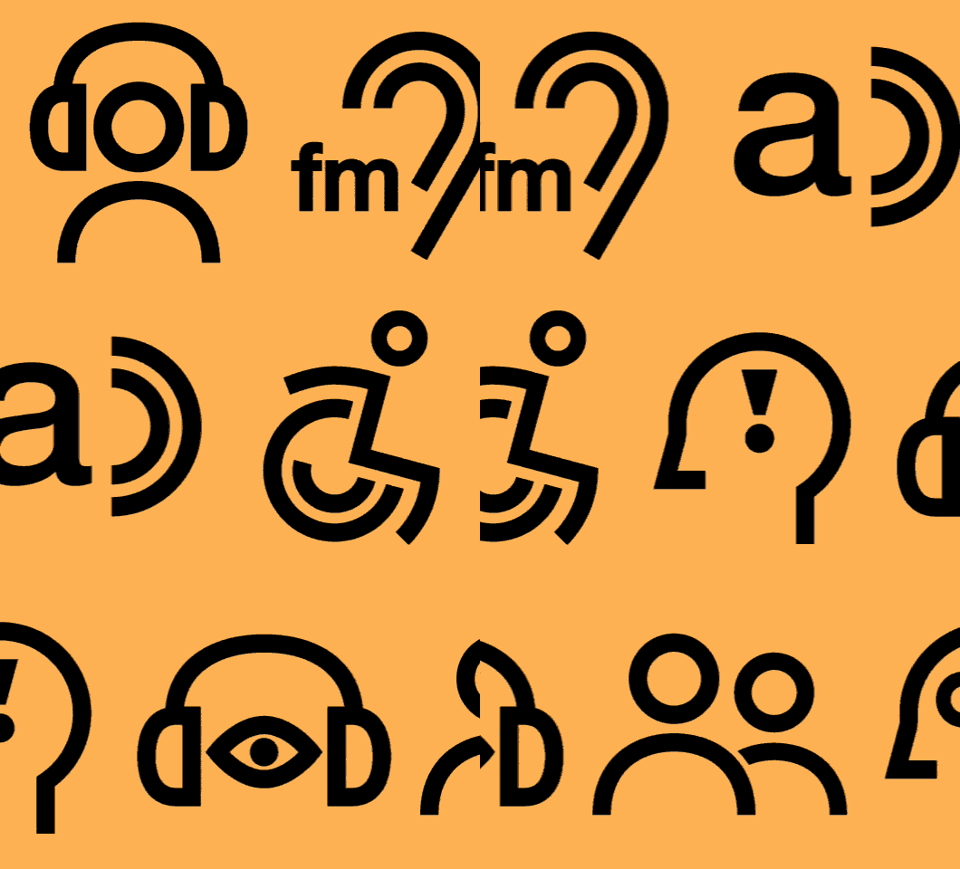
Addressing the lack of coherent iconography for disabled people, this project seeks to create a universal set of pictograms that communicate inclusive services and accessibility features consistently across websites, apps, signage, and printed media.
Established accessibility symbols such as wheelchair and hearing icons were noted as recognizable yet visually outdated and inconsistent in style. This highlighted a tension between learned symbols and intuitively understandable icons, and underscored the role of context in meaning. The idea was to develop a coherent icon system built on recurring elements and a universal visual language, while integrating playfulness and approachability, aiming to shift accessibility icons from functional add‑ons to integral parts of the communication system.
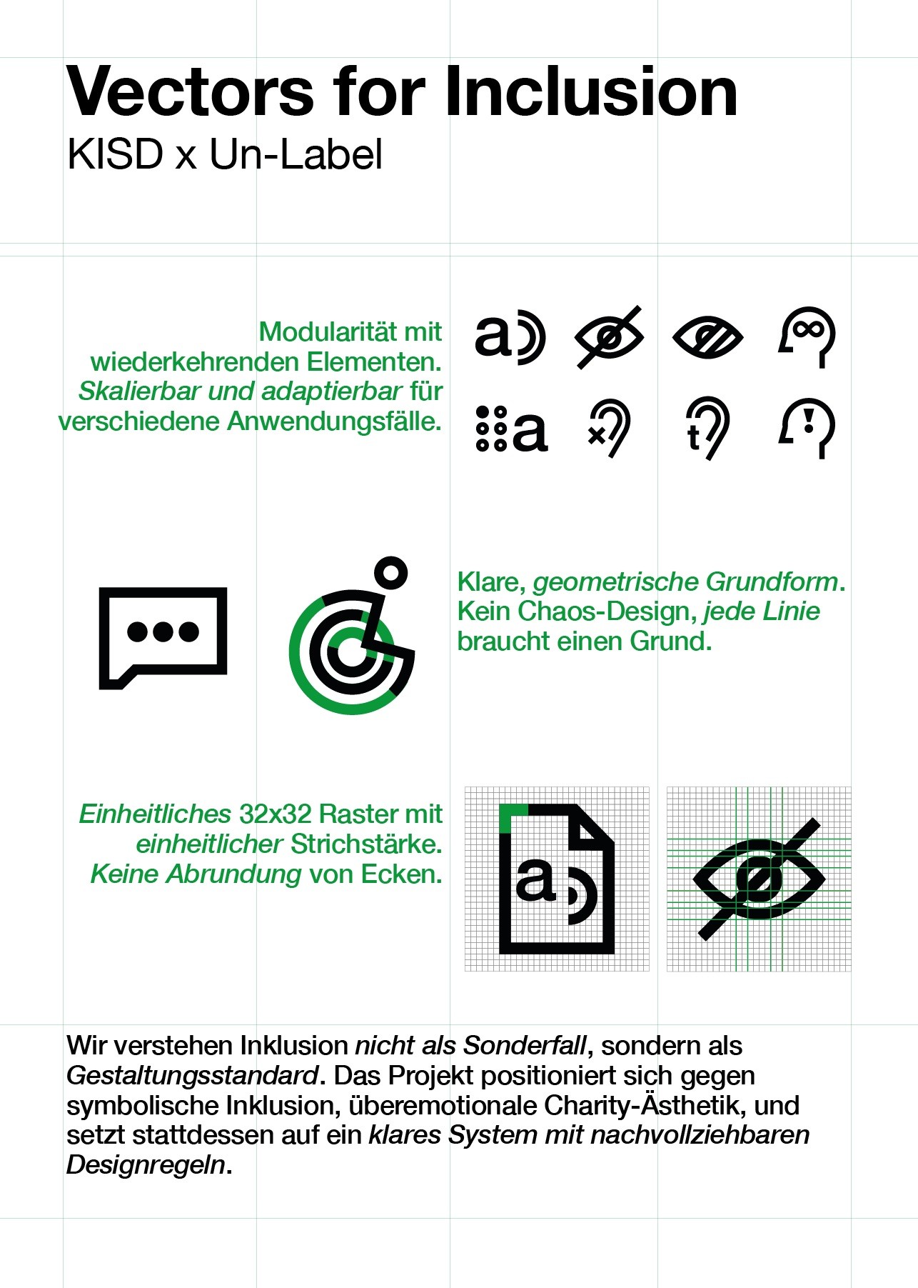
The outcome is a modular, scalable icon system based on a strict 32×32 grid and uniform stroke weight. Recurring elements such as ears, speech waves, and document shapes are reused and recombined to ensure visual coherence across categories. The set combines established symbols with newly designed ones, and delivers a scalable, contemporary aesthetic suitable for both digital and physical environments.